Friday, 24 March 2017
Thursday, 23 March 2017
Evaluation 1 - 9 Frame Analysis

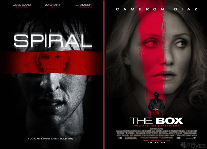
 Frame 1: This is my final film poster that I have created for my media A-Level production called 'Psychosis.' This has been created after the research I have done to try and understand the conventions and understanding of the 'Thriller' genre. After researching the most popular thriller film posters, I have discovered that the main, most successful thriller films, such as; 'Gamer', 'The Spiral' and 'The Box'. The conventions which they used in order to represent the genre in the most convenient way, was through the colour used on the poster. This became heavily used within my own poster as I used the different colours to connote different meanings within the poster, which were; black. white and red. Each of these colours, enabled for the audience to create a representation of the film before even viewing the film. For example, the colour black was used in my poster a lot to represent the mood of the film. This is because our storyline involved a dark past with negative actions, resulting in death. I felt that it would be good to use this after my research to emphasize to the viewers that film will involve negative, gripping actions and will keep them on the edge of their seats. Also from the black they can connote that one of the characters will be an antagonist and will be involved in the death or killings of people as black could also signify death. Also the colour red was used in order to exaggerate the darker aspect of the thriller genre, which can linked to blood and danger as the antagonist is causing mayhem and making people around the town scared. After the research this became a pinnacle of my work as the majority of the posters that i had looked at, included the same colour aspects which made me question the poster and make connections positively. Therefore I decided to follow the colour scheme of red, black and white to allow the audience to relate to other thriller films such as 'SPIRAL', 'The Box' and 'Gamer'. I have also decided to place my main character in the centre of the page to emphasize the fact that he will be the main feature in the film and then having the other personality or being behind him off to the left lurking in the background, allowing the audience to identify that this person will also play a major part within the film. After comparing to the research that i had done, I started to identify that there was a common occurrence of the main character being the centerpiece of the page with some other person creeping through. I decided to take inspiration on this and use my own take towards the poster. Instead of putting a clear image though, I made sure to distort the faces by putting an effect on the picture so the audience had to guess who the person was, which would hopefully intrigue them into watching the film. The last convention which I felt was convenient to use, was the use of the simple 'Orator' font which i used for the title in my poster. This is because it allowed for a good contrast between the two main colours that were constantly being used and allowed for the audience to identify straight away what the film is called as it can be seen, straight from the first look.
 Frame 2: The next and second frame in my analysis is the magazine cover, which I created for the promotion of my media film, 'Psychosis'. I found that one main poster became very prominent in providing ideas and inspiration towards my own magazine creation due to the conventions that are being used. The magazine cover, which I took most of my inspiration from was the magazine cover for the magazine 'Empire' who's focus on the edition was the film 'Scott Pilgrim VS the World'. This is because it firstly gave me inspiration towards the name of my magazine. This is because I have identified that even though the Scott Pilgrim film name is very different, it has context towards the film and makes sense, no matter how weird it is. Therefor, i felt that what ever name i wanted to use would be successful as long as it related towards the genre of the film or magazine. It also helped me with the image placement of the main characters of our film. This is because they made sure that their main character was the centerpiece of the magazine, so that the audience can focus and easily identify that the character. Therefore as you can see i followed the same route as my poster and with inspiration from the Empire magazine cover i placed it where the characters would catch the eye. I can also identify from my research that magazine also promote other films around the main images to try and draw the audience in to buying the magazine as it is showing them that they can offer an array of different promotions, interviews and article pieces, to keep the audience enticed for the whole reading experience. This can be seen on my magazine cover where there are white text boxes promoting other local films and shows competitions and exclusive interviews. Once again i used the white, red and black colourway to contrast against each other and make it easier on the eye for the audiences reading pleasure. This can be seen with the red box behind the white title of the magazine cover.
 Frame 3: This frame focuses on the production company of the film. The frame includes a moving picture of the moon crossing over the sun, creating an eclipse of the sun. The main reason why we felt that the name 'Eclipse Studio's was relevant towards our film and was an upgrade from what we previously had was simple. This is because we feel that an eclipse signifies mystery through the darkness which is what we feel that the thriller genre as a whole does. As one of the main features of a solar eclipse is the dark colours, we felt like this would give the audience an insight into what the films offers, due to the connotations that you can make with the colour black could signify death, evil and power which all feature in the film regularly. Also the clip is animated, meaning that the sun actually becomes eclipsed from the moon. This adds a sense of realism and professionalism towards the production company as many have moving images are used from the major production companies. After looking Warner Bros. Productions and Paramount Pictures, I could see they also went with a simple design however they look professional and are easily identifiable for a viewer, which could lead to them already pre-judging the film into thinking it will be good as such a recognizable production company is supporting the film.
Frame 4: This frame focuses on the opening section of my film trailer from my psychological thriller, 'Psychosis'. This is one of the many different setting shots we used in order for a mood and tone to be set from the start. After analysing the trailer of 'Se7en' and 'The Girl on the Train', we felt that adding the setting shots into the trailer would help the fluidity of the trailer as well as easing the audience into the trailer. This is because we identified that both trailers had used setting shots in order to set a tone towards their trailer, as well as keeping the audience guessing as they are waiting to see the relevance of each shot and see how it links to the overall trailer and film. We also implemented this shot as this is a stereotypical feature of the thriller genre (eerie setting shots), therefore we felt this would make the trailer more realistic and professional. The target audience for our trailer will realize that we are using this and will identify that this film should suit to their viewing needs. Lastly, we made sure to film on a dull, dreary day, to ensure that all the audience member's can see that the mood of the film is negative mood, leading to the fact that they should be able to identify that negative situations are going to occur, matching the stereotypical genre convention of the dull and dreary colour scheme.

Frame 5: This frame is also towards the beginning of the trailer where the main character starts to occur the problem with the split personality. The shot used is a long shot of the main antagonist, committing his first murder to his first victim. The shot of the murder is intentionally distorted for the viewers as our goal is to in the trailer was to try and keep the audience guessing who is the main antagonist and why does it link into the main characters life. Therefor, we thought if we distort the shot, the audience wouldn't be able to identify the character and this would intrigue them to watch the rest of the film or trailer as they would be very curious into who this murderer is and they would want to try and understand why he doing such terrible acts by creating a relationship and learning his past to sympathise with the antagonist in any sort of way. Also the scene was shot purposely at night with the emphasis on the darkness and mystery behind the shot. This connotes that the actions that he is doing are negative and the fact that he is going out of his way to end the life of this normal person as it's at night, when no one would be out and in a field, so at the time their would be no chance of seeing him do this. The time of day that this section was filmed helps once again progress the mood of the storyline which is negative due to the severity of these murders and actions. However, this could also create suspense and fear for the viewers as they could be waiting for a jump-scare or someone finding these murders.

Frame 6: This is a very simple screen grab of the trailer but is one of the most important aspects towards our film trailer. As the trailer contains no dialogue, it is very hard to understand the narrative of the trailer which could confuse the audience. As people tend to shy away when the narrative is too complex to understand, as it isn't enjoyable for them to watch as they are trying to hard to comprehend the difficult storyline which we have implemented to equal the complex severity of the mental illness that the main character is experiencing. Therefore, we felt that if we added in a few text screen in the trailer, the audience would find it easier to comprehend what was occurring, which would make the narrative easier to understand, which in turn would pilot the audience into a more pleasurable viewing experience. Once again the background is the colour black due to the mood of the film and the negative circumstances which the main character is putting himself in and will make the audience weary after each text screen as it connotes a pessimistic outlook for the main character. Lastly, we used a simple white coloured Orator font to first contrast the black background and make it easier for the viewers to watch, but to also keep the viewers entertained. This is because we are not looking to divert the audiences attention away from the gripping storyline but instead make it easier for them to follow by just adding simple font and colour text screens to keep the trailer flowing smoothly.
 Frame 7: This shot is used in the middle of our A-Level media trailer to progress the storyline in a gripping manor. This shot plays a large part within the extract as it provides versatility towards the trailer within the shots we are using. The shot we used was an extreme long shot, point of view shot when filming the shot. The main reason for this was to give the audience a feeling like this character is being watched. Therefore, we made the cameraman hold the camera, whilst watch this new character walk in their house towards the door from a distance. Any average viewer would be able to identify that this character is now being stalked by the antagonist and will likely end up in the same way the previous character does. However the reason why this shot is shaky, is to try and realism for the narrative to try and create the feeling professionalism from a low level media team. Our main goal for this shot is to create the feeling of suspense and anticipation for a viewer as they become further intrigued by what is happening in the narrative. This is because we want them to question who this character is by what he is wearing and what he is holding creating a large emphasis on the mise-en-scene used in the scene. Either way, the audience will be able to identify that this is a new target and he is more professional and well-dressed compared to the casual young adult seen previously being killed. Lastly the shot has a large emphasis on the mental illness side of the trailer as no normal person would stand far away and watch someone they don't really know, showing that the narrative is progressing and the mental illness is at the highest point of impact. This is also a counter-type to the stereotypical thriller genre convention as a wealthy male is being targeted instead of a women. In turn, this shows that no one is safe within this
 Frame 8: This shot is used towards the conclusion of the film trailer and main used and aim is to
 emphasise the threat of the main antagonist. A mid-shot is used in the scene where the character is lurking outside the house of his next victim before entering the house. This focuses on the mental illness side of the film as he has fully cracked and lost control of himself in the film and is taking anyone out he can. This shot is used in a dark and dull hallways to once again emphasise the stereotypical conventions that would normally be seen within the thriller genre. After researching such films as 'Se7en', i have identified that the weather or mood of the film is always bleak and cynical which would allow the audience to make the connection that if the weather or lighting is low-key, only negative situations are going to occur. In turn this will create anticipation for the viewers as when they see the shot is low-lit, they will automatically make the connection that a murder, torture or any type of awful situation is about to occur soon enough. Lastly once again you cannot see the antagonist face when he is lurking around. This is to create the emphasis of mystery of the character which links with the complex narrative, allowing for the viewers to be mainly stunned by all the twists and turns of this insane character is relentlessly hunting down all these people, whilst the audience don't even know who he is.
Frame 9: The last frame of my analysis is a screen-grab taken at the end of the film trailer. This is carried on from the previous text box saying 'He is..'. This creates an added impact as it creates an added identity to the character, instead of just some unnamed psychotic killer in a film trailer. Also the audience automatically identify that the character has some sort of psychological problem with him, due to the name 'Psychosis'. This automatically implies that he has some sort of mental illness that is causing him to react in different manors and hurt people for the satisfaction he needs to live his life and get revenge on people that had hurt him before, by ruining their lives, through killing loved ones. This added context to the name also as it was relevant to the illness of schizophrenia with added affects to ensure that the storyline is gripping. The overall narrative plot was mainly inpsired by 'Se7en' due to the harshness of the killings and how psychotic the main character was when carrying the actors. This could also be a gateway into leading people towards gaining help if they are suffering from any mental illness they could have, or inform parents in the most extreme way possible.
Subscribe to:
Comments (Atom)